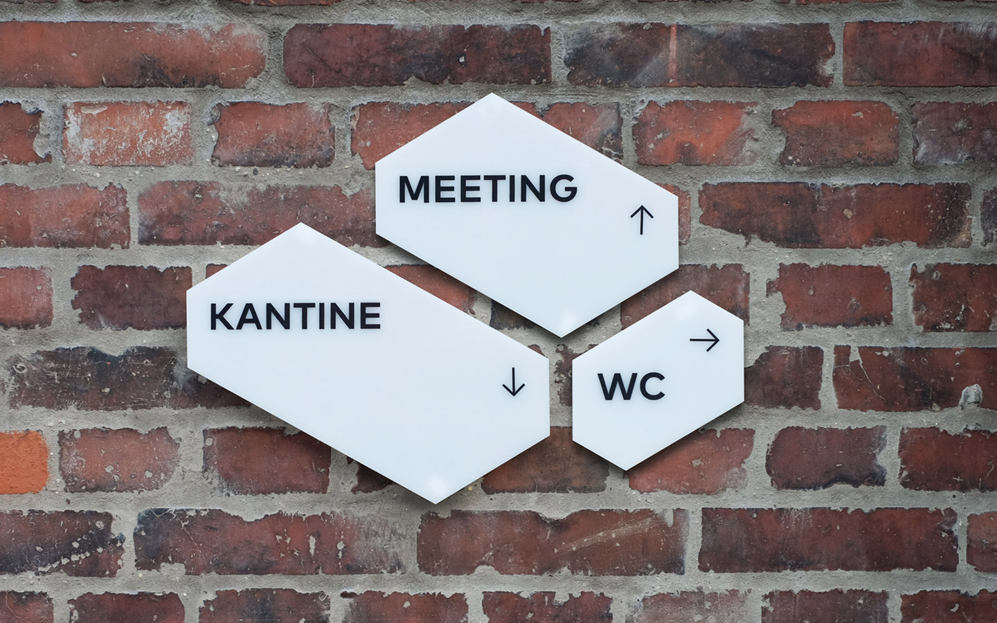
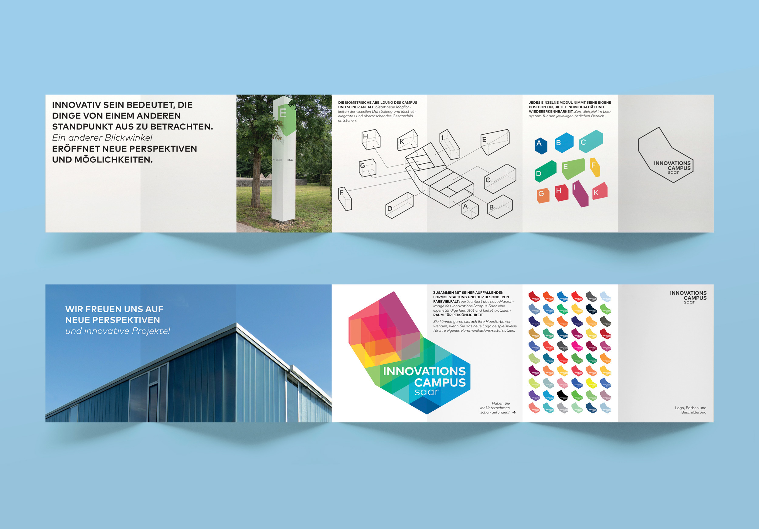
Internal signage was based on their relevant floor plan proportions.
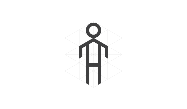
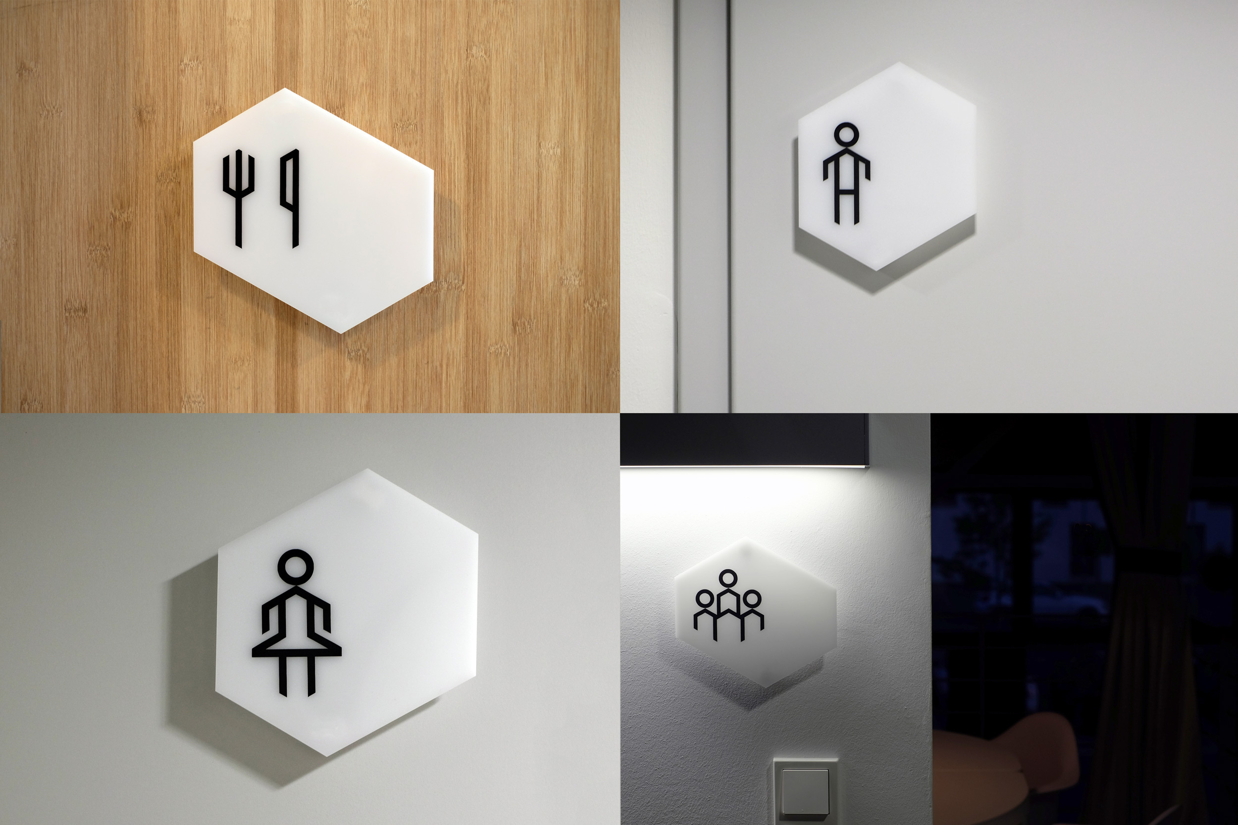
An isometric grid was set up to design the icon set.
Client: GIU, InnovationsCampus saar
Category: Signage, Corporate Design
Year: 2015
Client: GIU, InnovationsCampus saar
Category: Signage, Corporate Design
Year: 2015
Client: GIU, InnovationsCampus saar
Category: Signage, Corporate Design
Year: 2015
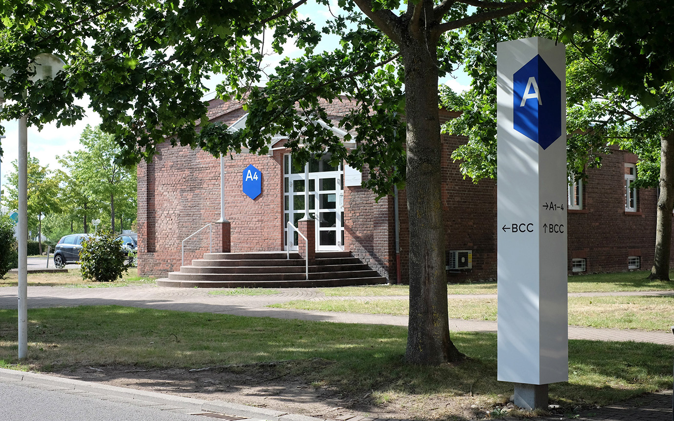
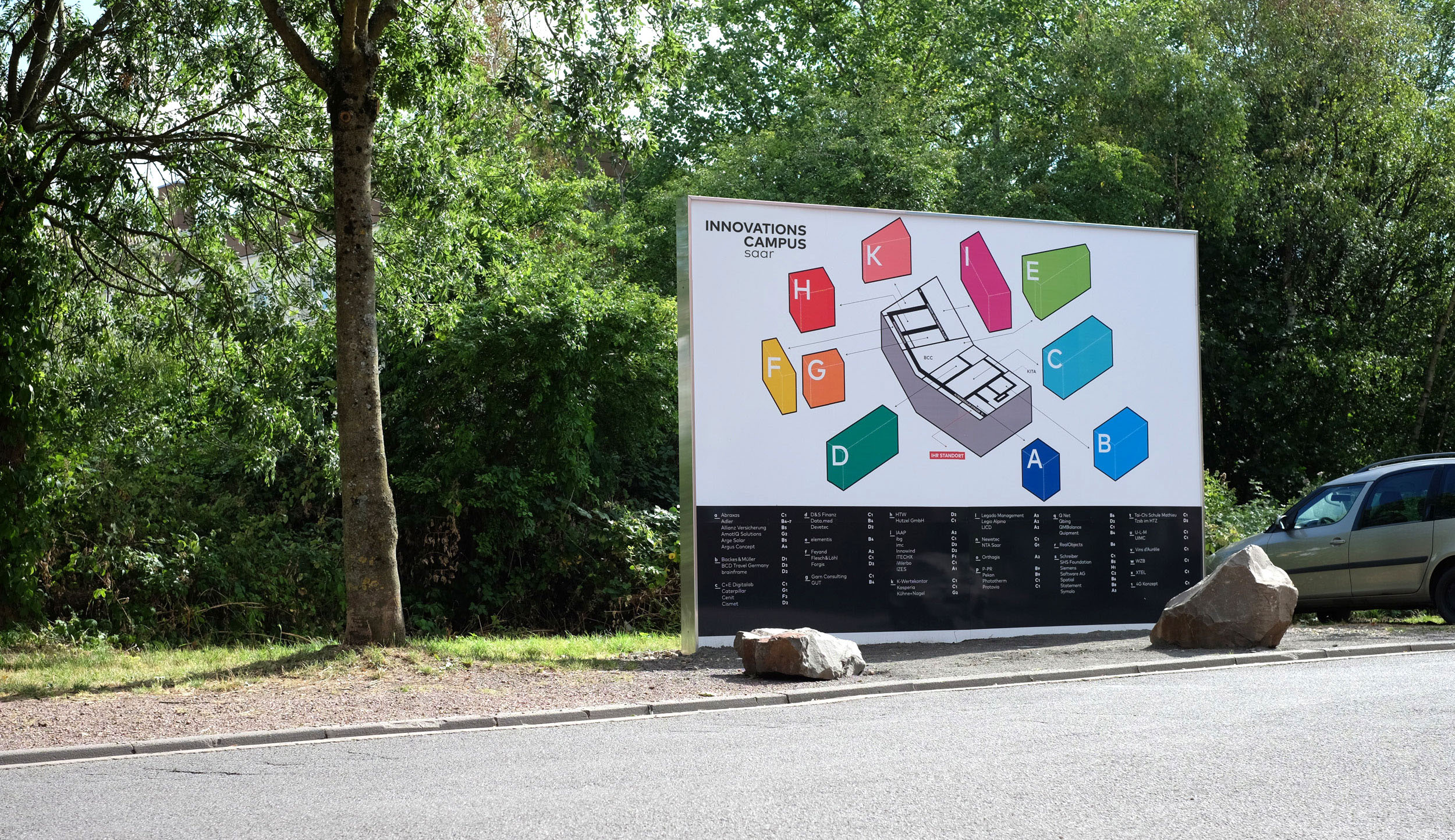
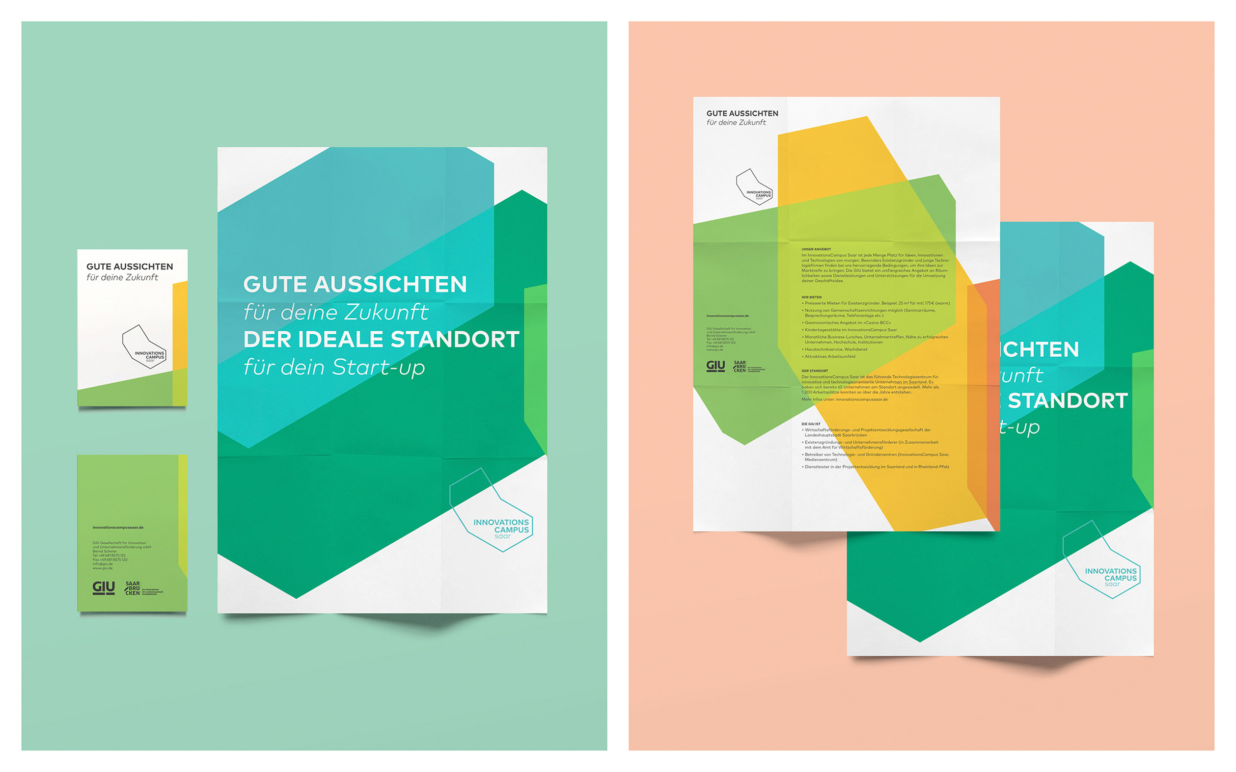
InnovationsCampus saar is a campus intended for innovative, high-tech companies and start-ups in Saarland.
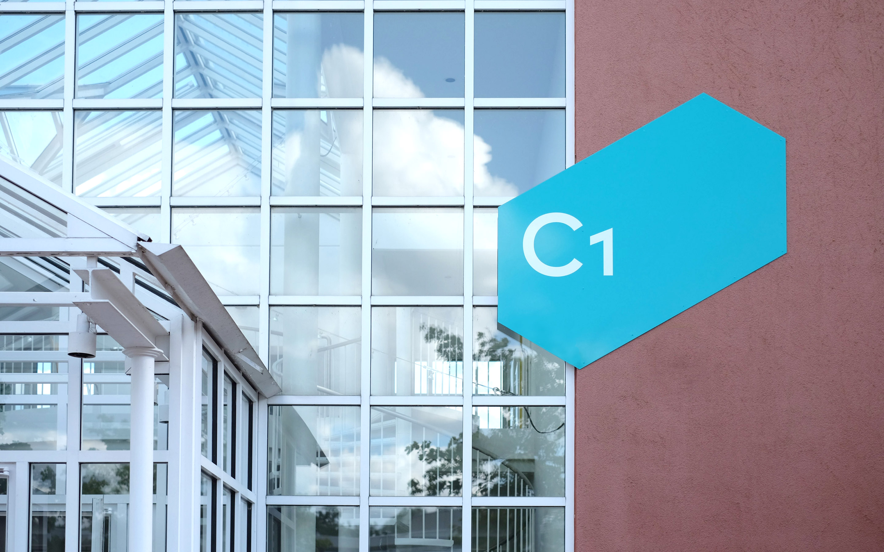
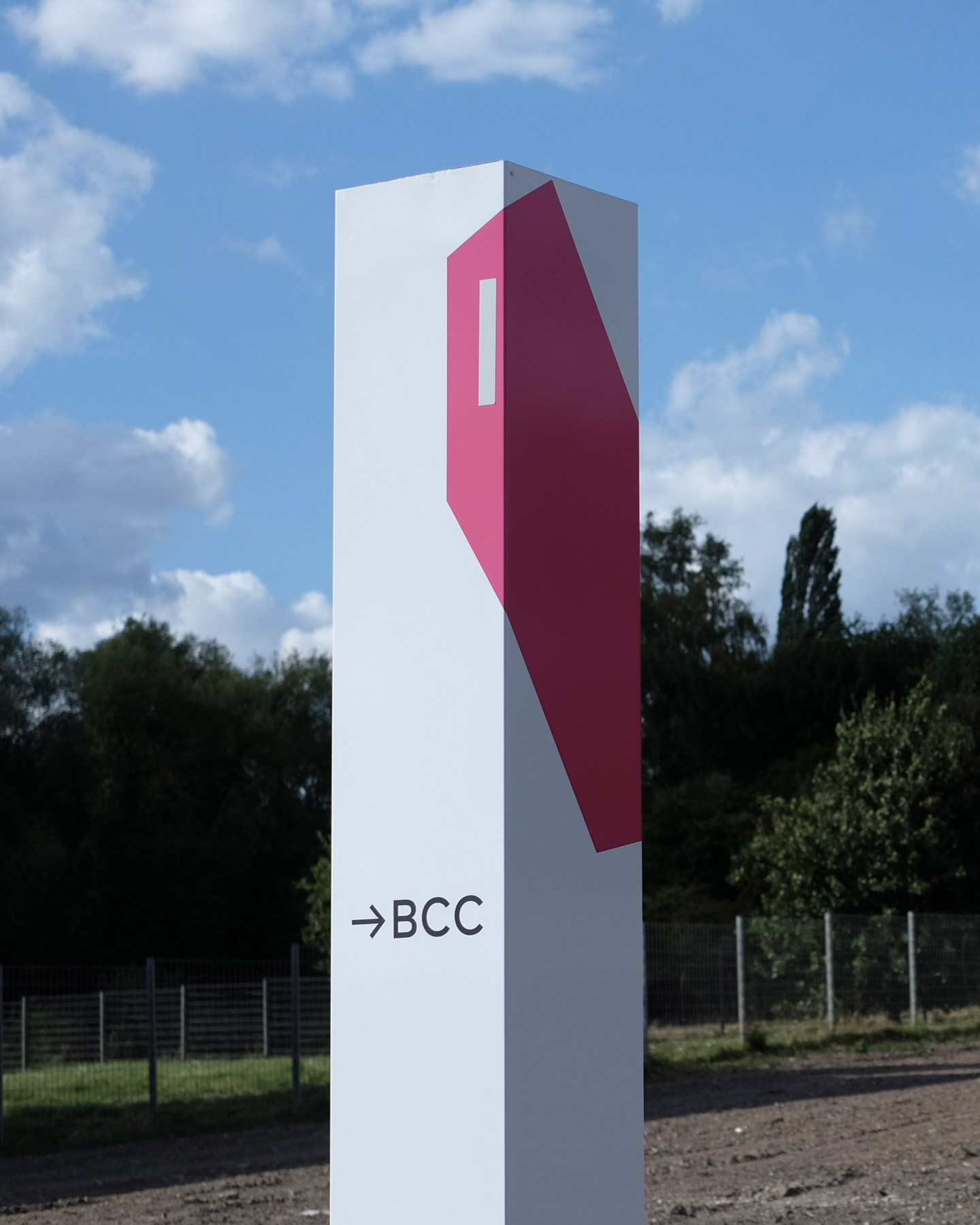
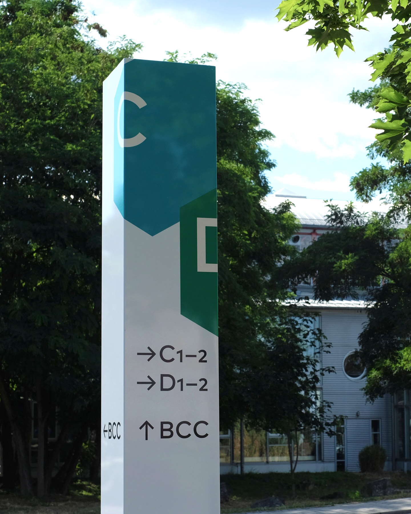
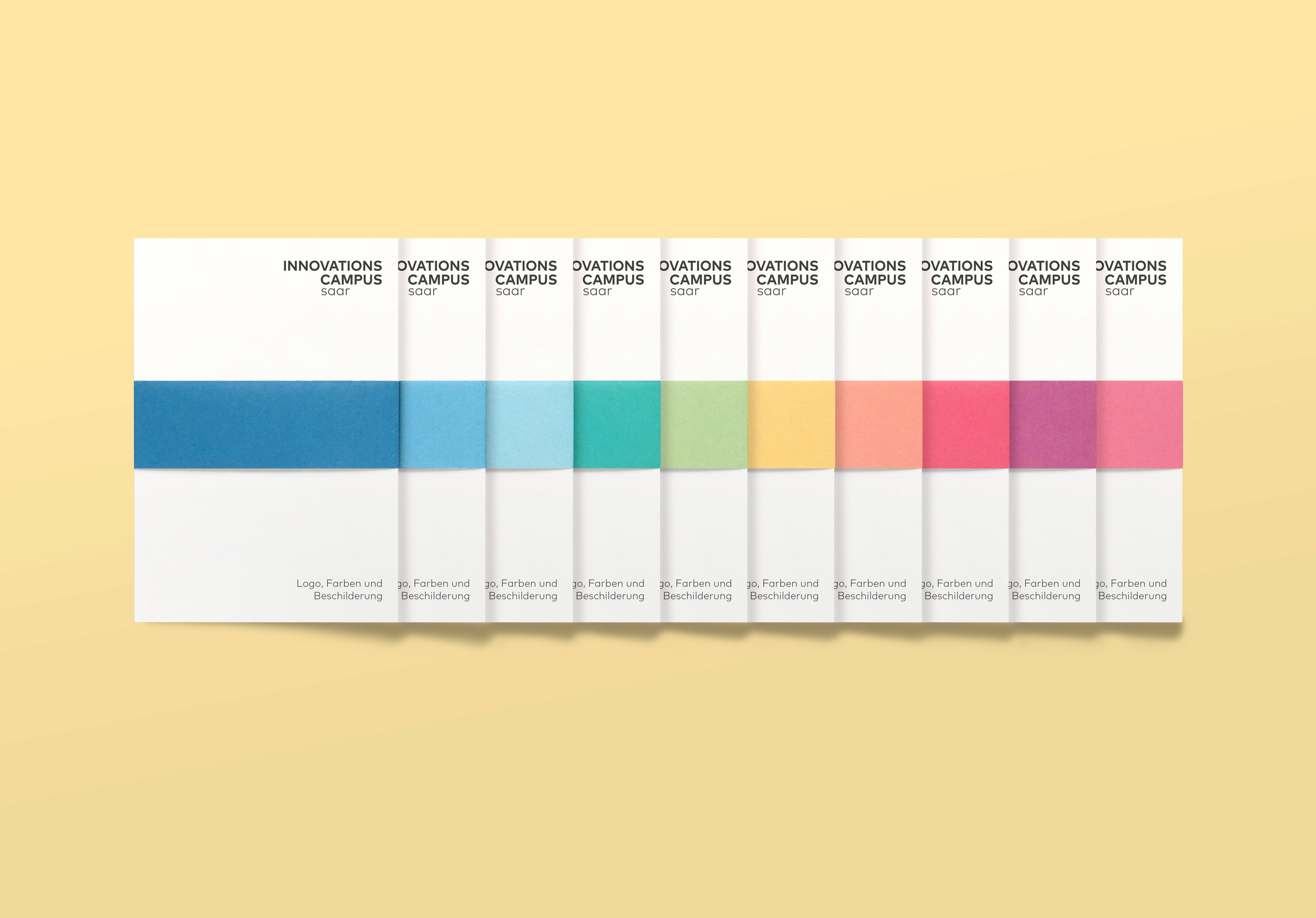
The concept for the identity was simple. The idea at the heart of innovation is to take something that already exists and look at it from a different perspective. The campus consists of 10 sections with the communal area, the BCC forming its “green middle”. By changing the way we looked at the footprint of the campus, the perception suddenly changed. To give the logo its depth, we extruded the 10 sections and allocated each with its own colour. The individual shapes and colours of each area was used to inform the orientation system. The combination of all areas made up the final logo.
By keeping the proportions consistent, it gave us a system whereby the elements could be combined to represent the entire campus or scaled down to dictate the size of the internal signage within a building.
In collaboration with Jono Garrett, Stefan Hübsch and Oliver Jungmann.